Pantone: Greenery is the colour of the year 2017
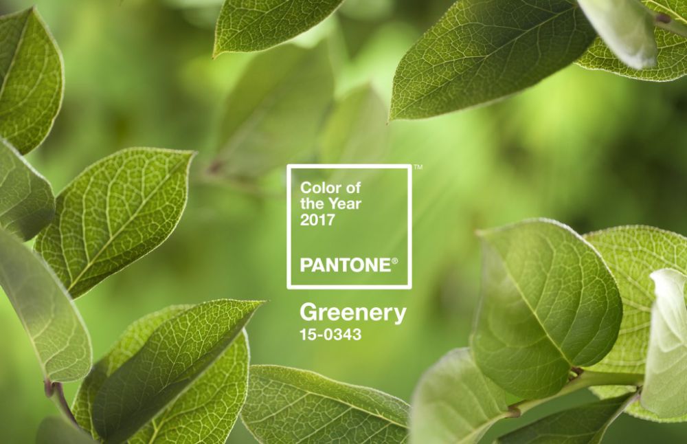
Colour company Pantone has revealed a zesty shade of green as its colour of the year for 2017. The colour, named Greenery, is described by Pantone as a "tangy yellow-green" often seen in foliage.
"Bringing forth a refreshing take, Greenery is a tangy yellow-green that speaks to our need to explore, experiment and reinvent," said Pantone. "Illustrative of flourishing foliage, the fertile attributes of Greenery signals one to take a deep breath, oxygenate and reinvigorate."Greenery – or Pantone 15-0343 – was already mentioned in the institute's top 10 colours for the fashion industry in spring 2017, released back in September.
In an interview with the New York Times, executive director of the Pantone Color Institute Leatrice Eiseman said the choice was made in response to a "stressful and tense world"."We know what kind of world we are living in – one that is very stressful and very tense," she said. 
"This is the colour of hopefulness, and of our connection to nature." "It speaks to what we call the 're-words' – regenerate, refresh, revitalise, renew," she added. "Every spring we enter a new cycle and new shoots come from the ground. It is something life-affirming to look forward to."
The Pantone Colour Institute advises the fashion, product, interiors and packaging design industries on the use of colour in design. It has has been choosing a colour of the year since 1999. For 2016, Pantone picked two soft colours – a baby blue and dusty pink.
"The Pantone team is dedicated to doing its homework. It’s always in your peripheral vision so-to-speak – as I travel, my eye picks up on interesting usage of color and I started to see Greenery in pop culture, even in stage lighting and then in film. There has been a much greater usage of green lately – we are definitely seeing it in fashion’s spring/summer collections for next year, which of course is a big influence.
The best example, however, is the Benedict Cumberbatch film, Doctor Strange. In the movie he wears a green amulet and there’s actually a green that’s used as a special effect in the film. My husband is a member of the Academy of Motion Picture Arts and Sciences (AMPAS) so we get a huge number of films every year through so that he can judge them and vote for them, and the moment I saw the publicity release I noticed the use of green." said Leatrice Eiseman.
Do you want to as a trendy touch of green at home or in office? Come discover our best Greenery-coloured items:
Wall Clock Cronofilla - Pirondini
Ceramic Fat Plant - Arcucci
Chair Snow 300 - Pedrali
Bowl KRB-3 by Karim Rashid - Bitossi Ceramiche
Sock holder - Antartidee


Minimalism in interior design has gained great popularity in recent years.
In fact, it is no coincidence that the philosophy of ‘Less is better than ...

The Design Week 2024, which ended a few days ago in Milan, was an extraordinary event which focused international attention on the ...


Everything seems to suggest a new beginning, even in ...

Room fragrances are ideal for anyone who wants to add a touch of ...